Web Colors and Icons Explained

I am frequently asked to explain my job as a professional Front-End Software Engineer/UI/UX Developer/Designer. If my listeners are still with me and are extremely polite, they request “Everything You Always Wanted to Know About Web Design (But Were Afraid to Ask Because it Might Be Boring) [the Mobile Edition, in 2 minutes or less].” Below is a distillation of two crucial topics, Colors and Icons.
Colors
Have you ever wondered why so many websites use the same colors? The consortium for web standards Colors Committee defines acceptable colors by working closely with browser makers, popular frameworks, and sports drink manufacturers. Just like other technologies and fashions, a color can get discontinued and become unsupported. Once that happens, the color becomes invisible in all browsers.
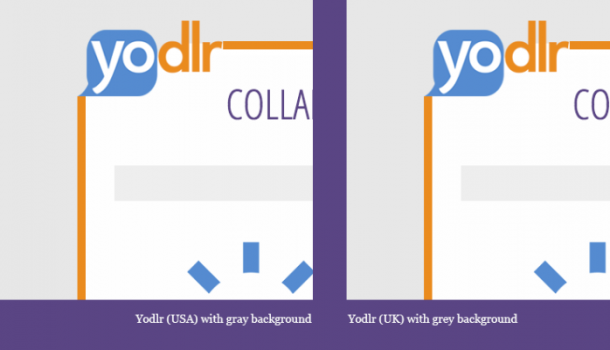
It’s important to please everyone. One user abhors amber; another loathes lilac. This brings most sites quite logically to the mathematical middle-of-the-road. At Yodlr we engineered the background color to appear Gray within the USA but Grey elsewhere.
I used the colors and shapes of Yodlr’s existing logo as a base. I was able to convince management to shell out the extra money needed for purple, a particularly expensive license because it uses both red and blue and is associated with royalty.
Icons
Creating icons for uncommon buttons is difficult. At Yodlr we needed new icons to show when participants were viewing a presentation and for our “Raise your Hand” feature. Some of the more challenging icons I have created in the past were for “Deodorant”, “Existentialism”, “Hot Pastrami” and “Cold Pastrami”.
A common but little talked about problem with shapes and icons is the dreaded “It Reminds Me Of”, or its acronym IRMO, which I just made up. IRMO occurs when you show someone your work and they say
“It reminds me of
- a skunk,”
- “our competitor’s logo,” or
- an icon already in use that means something completely different.
You can’t argue with IRMO. (No, it looks nothing like a chandelier!) Sometimes you’re looking at your work and realize it resembles private body part/s. Experts agree that Body-part IRMO is more widely-spread than previously thought but generally goes unreported because of the stigma. If you experience Body-part IRMO, experts advise, hide your work and go back to the drawing board.


Amusing and delightfully informative. Who knew
colors were licensed and might be taken out of play, or that IRMOs (good acronym!) are the bane of the designer, while the bread-and-butter of administers of the Rorschach test. As for body parts, who raised this woman?